
The Wombat brand
One wombat, one hard hat, eight pillars. This is the visual system behind Wombat: a vector mascot that explains, a monochrome icon set for the framework, and a terminal that keeps the whole thing honest. Everything on this page is downloadable.

A mascot with a job.
The wombat wears a hard hat because the work is foundations: controls, evidence, exit strategies. The head is the mark. The six expressions cover the tone of voice — use them to clarify a sentence, never as decoration.
Idle
The default. Friendly, not goofy.
Download SVG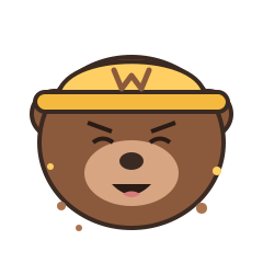
Digging
Controls, evidence, and finding what is buried.
Download SVG
Alert
Risks and blockers. Never a generic error.
Download SVG
Celebrate
Releases, contributions, and the 8/8 moment.
Download SVG
Thinking
Architecture reviews and open questions.
Download SVG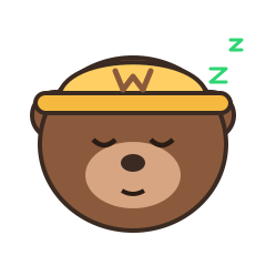
Sleepy
Idle workloads, quiet weeks, scheduled maintenance.
Download SVGThe whole wombat, six ways.
The head is the mark; the body is the character. These painterly PNGs carry the same control-room backdrop, so the wombat can point, dig, explain or celebrate without changing style.

Stand
The neutral base. Use it when the words do the work.
Download PNG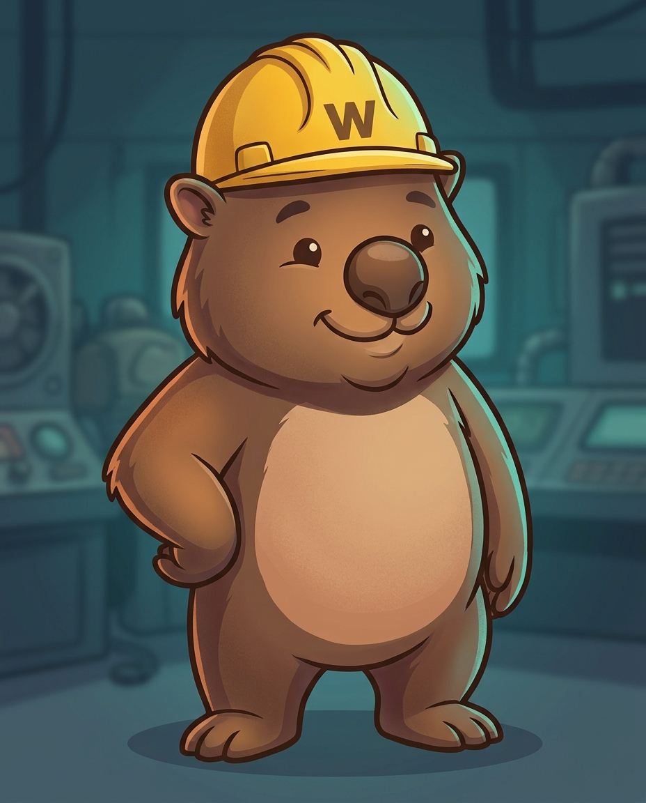

Wave
A greeting, a thank-you, a first contribution.
Download PNG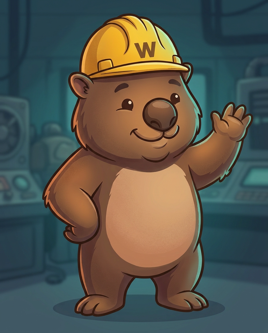

Present
Point at the diagram. Let the wombat do the pointing.
Download PNG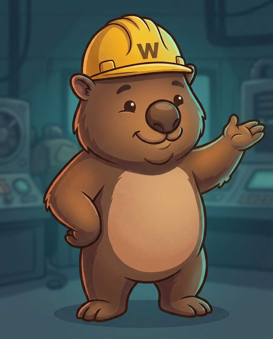

Dig
Controls, evidence, and the things people bury in slide decks.
Download PNG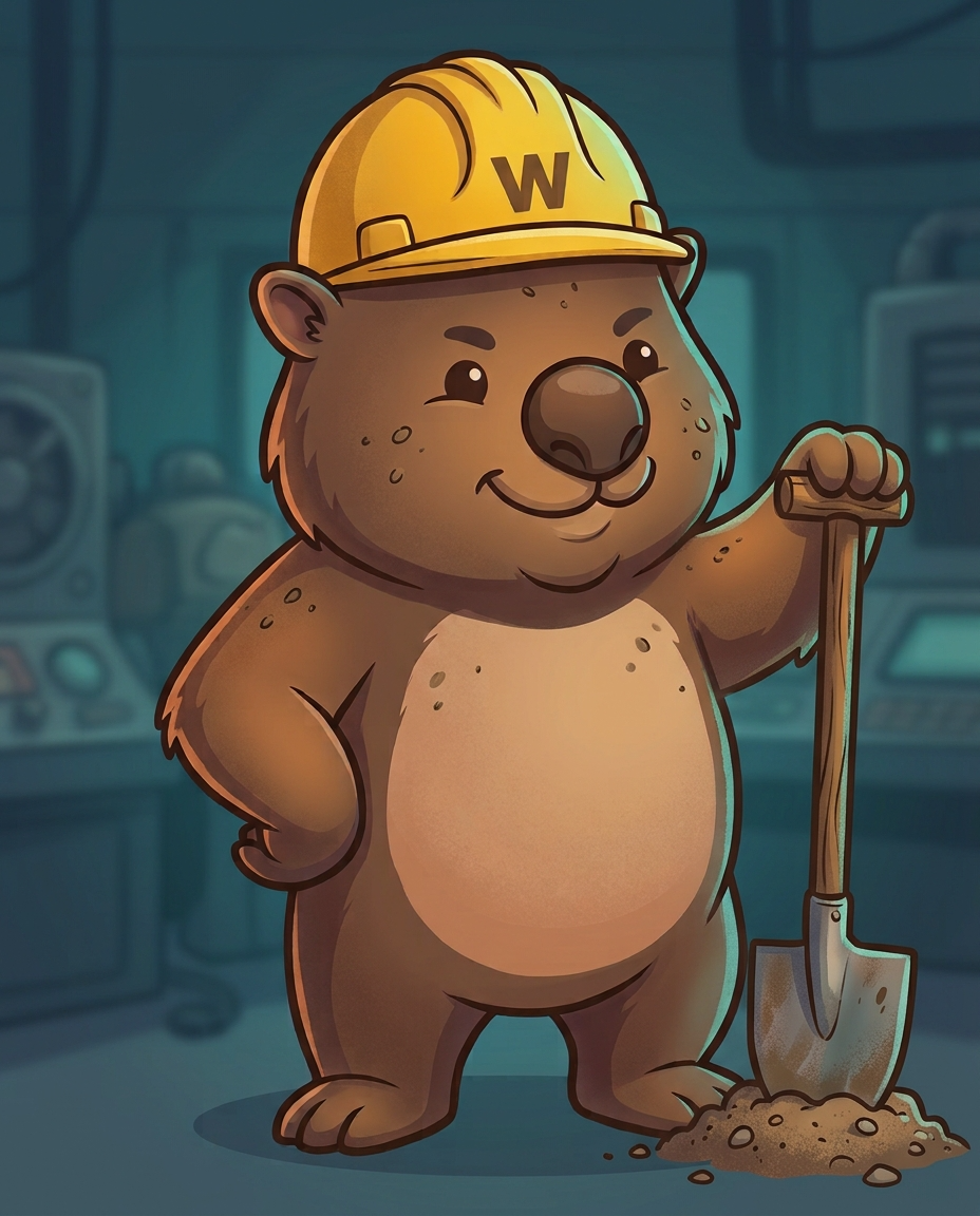

Celebrate
Releases, contributions, 8/8.
Download PNG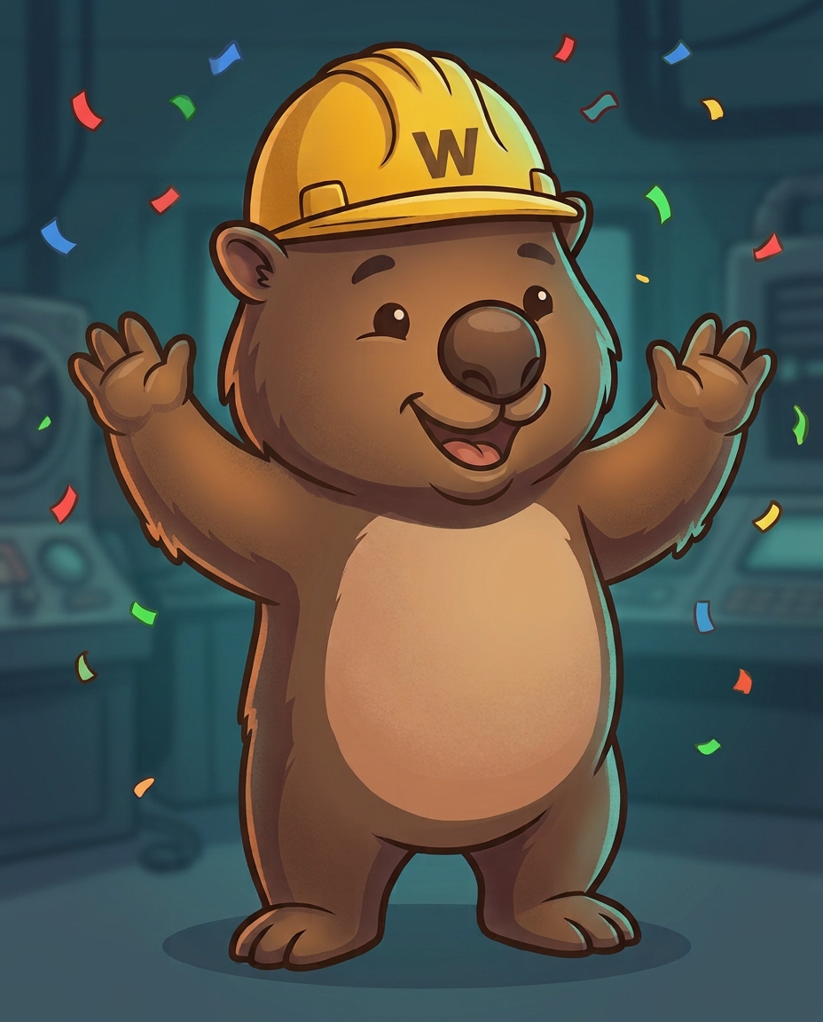

Think
Architecture reviews and uncomfortable questions.
Download PNG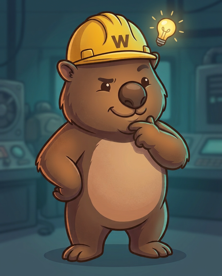
Full-body PNGs, 928×1152, with the control-room backdrop included. WebP variants are used on this page.
Eight pillars, eight icons.
One shape per pillar, drawn on a 24×24 grid with a 1.75 stroke so they sit next to Lucide icons without arguing. They inherit currentColor, which means one file works in light and dark mode. No mascot inside the icon — the framework gets its own language.


Live examples: the 8 pillars page and the control room.
Color with a job.
The product UI is theme-reactive and keeps to one accent. The mascot has its own warmer palette — the hard hat is the constant. Click a swatch to copy its hex value.
Three voices.
League Spartan carries the headline. Plus Jakarta Sans carries the sentence. Monospace carries the terminal and anything that should feel like evidence.
The rules we actually keep.
A mascot earns its place by being useful. These are the lines we do not cross.
Do
- Give the mascot a job: let it point at the thing the reader should look at.
- Keep the hard hat yellow and the outline dark. The hat is the constant.
- Match the expression to the sentence — idle for calm, alert for risk.
- Leave one brim-height of clear space around the head.
- Use the pillar icons for framework concepts; they are drawn to work at 24px.
Don't
- Recolor, stretch, rotate or crop the mark.
- Put the wombat in a suit. It is a builder.
- Use the mascot as a bullet or a loading spinner — that is what the icons are for.
- Place the head on busy artwork without a solid surface behind it.
- Use hard-hat yellow for buttons. That is brand blue's job.
Social cards that look like the product.
Every pillar gets a generated 1200×630 card: the pillar icon, its code, the terminal palette and the same hard hat. Pillar pages point their image: front matter at these files, so a shared link looks like it came from the same room.
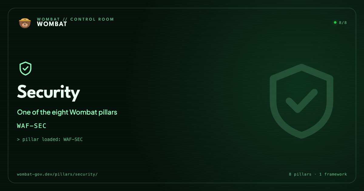
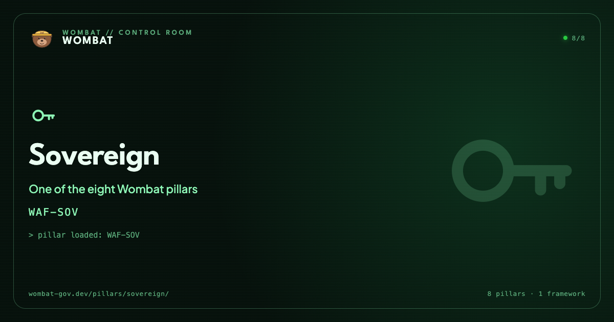
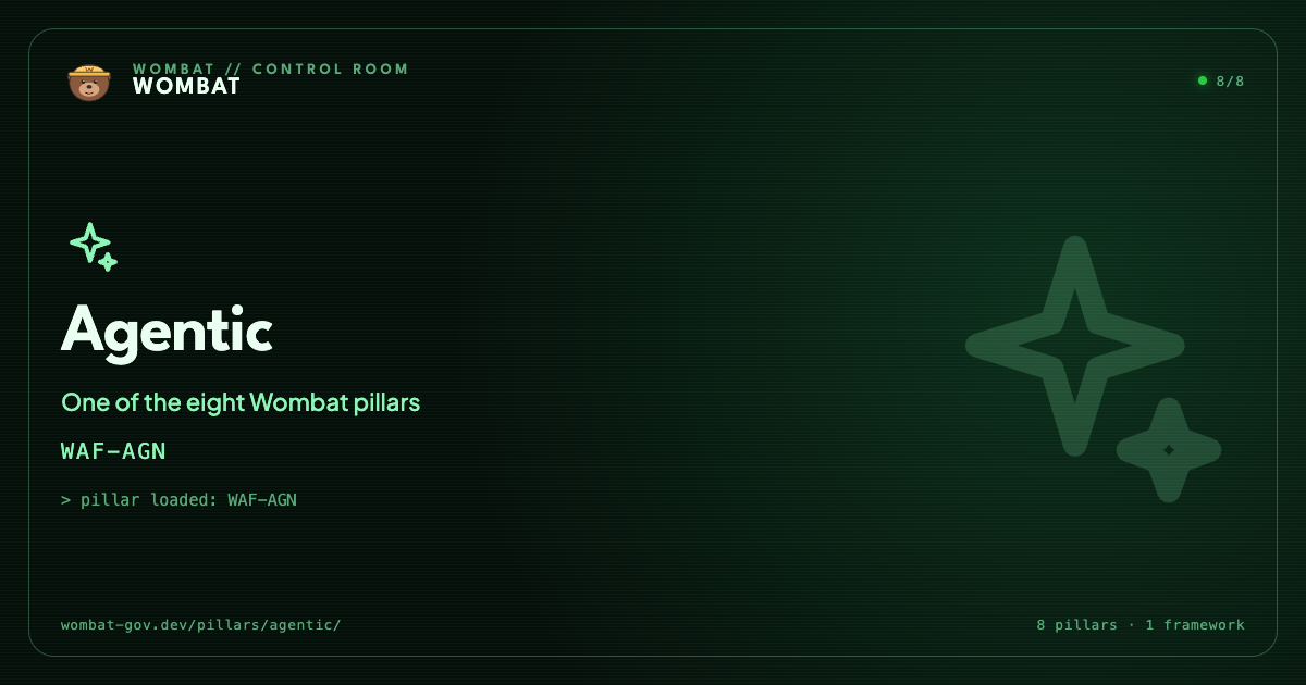
Generated with the same template as the rest of the site; see scripts/generate-og.mjs in the repository.
Take it with you.
The full set, plus the avatar for the places where a square is all you get.

Brand assets are for community, press and project use. Keep the hard hat yellow, don't stretch the mark, and don't use it to imply endorsement of something the project has not endorsed. Questions? Talk to the community.